The last chart to analyze in Blueprinter Tool 3.6: Analyze Preference Data is the Outcome Value “Heatmap.” And it’s the chart users sometimes find confusing. Let’s look at how it’s created, and then some tips for using it.
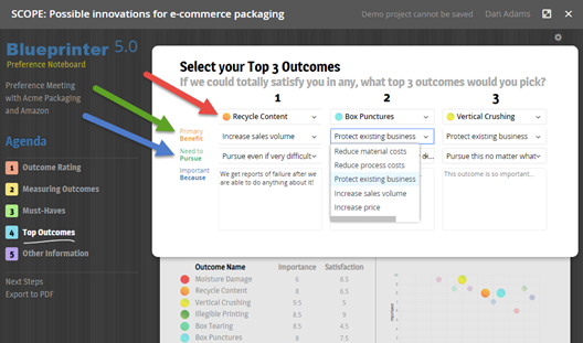
In the 4th part of your Preference interviews (Top Outcomes), you asked three questions that drive this chart:
- “If we could totally satisfy you in any, what top 3 outcomes would you pick?” You used a drop-down menu for customers to select three outcomes. (See red arrow below.)
- “What is the primary benefit you’d receive from this outcome?” You gave them 5 drop-down menu choices. (See green arrow below.)
- “How aggressively should we pursue this outcome?” You gave them 5 drop-down menu choices. (See blue arrow below.)
Blueprinter software uses weighted-average responses for the entire market (as you defined it in the Market View) to create the Heatmap below. Notice that the horizontal axis shows the 10 outcomes and the vertical axis shows the 5 benefits. This means there are 50 possible combinations (cells) and each customer selects up to 3 cells during their Preference interview.
Imagine a customer said they wanted to improve “Vertical Crushing” strength… because this would help them “Reduce material costs.” The software would record one entry for the lowest-left cell in the Heatmap (yellow arrow below). The more times customers in the market cited a cell, the “hotter” (whiter) that Heatmap cell became.
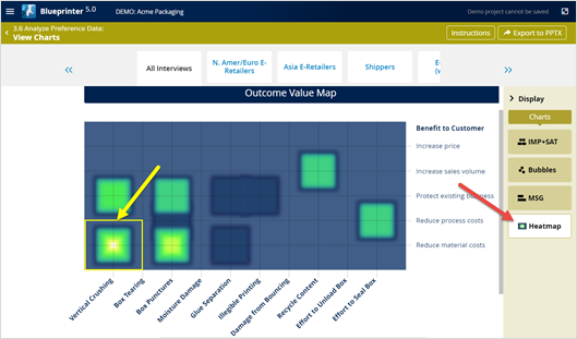
It gets a bit more complicated, though: The software doesn’t just count the “frequency” of cell citations, it also considers the “intensity.” It gathers the intensity data from customer answers to your third question, “How aggressively should we pursue this outcome?” So in reality, the Heatmap is displaying both the frequency and intensity of customer interest in pursing outcomes for specific benefits.
Now that you know how your Heatmap chart was created, how does your team use it? Consider four strategies:
- Cross-check MSG’s: Compare the “hottest” peaks in your Heatmap to the highest Market Satisfaction Gap outcomes. They should be very similar. If not, discuss with your team why this is the case. You may even need to check back with customers if this happens.
- Lower-vs-Upper chart: You can only do two things for customers down the value chain: 1) Improve their products and/or 2) improve their processes. Notice the two upper-chart benefits (increase price and volume) are about their products, while the lower two (reduce process and material costs) are about their processes. (The middle—protect existing business—could be about either products or processes.) As you develop your product, you’ll want to work closely with customer marketing contacts for upper-chart hot spots… and customer operations people for lower-chart hot spots.
- Value calculator input: At some point, you’ll begin building a value calculator… in which you “model” the benefits customers will receive so you can properly set your new product price. Be sure to use this chart to identify how customers will benefit. Will they be selling more of their product? Selling their product at a higher price? You may need to engage an industry expert to help predict this, but this chart is a good starting point. The better you can predict how customers will benefit from your innovation, the more of the value you’ll capture through pricing.
- Themes: As with the Market Satisfaction Gap chart earlier, look for a central theme you could pursue with your new product and its promotion. But this time try “grouping” the outcome benefits by one of the five benefits. For instance: “Our new ingredient lets you create a premium product for your customers.” (Higher selling price.)
For more on analyzing Preference interview data, see e-Module 24: Preference Interviews B, at www.blueprintingcenter.com > e-Learning. For research on how AIM clients conduct Preference interviews, download Preference Interview Research Report.
Keywords: Blueprinter 3.6: Analyze Preference Data, Outcome Value Heatmap, Heatmap, Market View, market sub-segment, analyze Preference interview data, sub-segment by region, sub-segment by point in value chain, sub-segment by business model, analyze Market View charts, input for value calculator