The two most important charts are this “IMP+SAT” chart and the upcoming Market Satisfaction chart. And it’s critical to get the IMP+SAT chart right first, because it helps you define your market segment(s). In the packaging example we used in the last article (Creating “Market Views”), we had interviews in different global regions, different points in the value chain (e-retailer vs. shippers), and different package sizes.
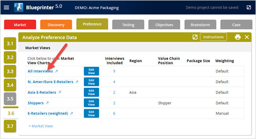
To view the charts for any Market View, just click its name in Tool 3.6: Analyze Preference Data (see “All Interviews” below):
After clicking “All Interviews,” you’ll see the screen below. Notice you can select any Market View across the top (red box below) and any of the 4 charts (blue box below). The first chart you see is the IMP+SAT chart for the Market View selected in Tool 3.6 (“All Interviews” in this case).
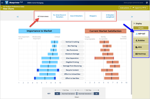
The IMP+SAT chart shows the market-averaged ratings for Importance on the left and Current Satisfaction on the right. And remember, you’re defining your market in each Market View when you decide which interviews to include and how to weight them.
The black vertical lines are the means (averages) for each outcome. And the full bars to the left and right of the vertical lines each represent one standard deviation. The smaller the bars, the more your interviewees agreed with each other. We like to see standard deviations of 2 units or less. If you have outcomes with larger standard deviations than this, you’ll see a bright color bar segment highlighting this. (See the bright blue segments in the chart above for “Recycle Content” and “Effort to Seal Box.”)
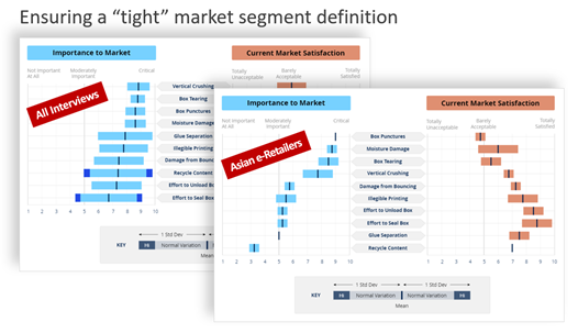
If your team saw the large standard deviations in the “All Interviews” IMP+SAT chart, a natural question should be, “Are there sub-segments where companies are in greater agreement with each other?” To test this, you create a Market View called “Asian e-Retailers.” Notice how much smaller the standard deviations are for Asian e-Retailers
than for “All Interviews”:
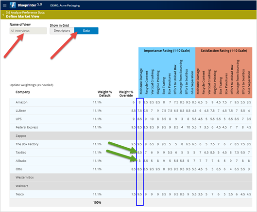
Sometimes it’s obvious which Market Views you should create, e.g. different regions of the world, or different points along the value chain. But in other cases, you’ll need to do some deeper investigation: In Tool 3.6, select “+Market View” and click the blue “Data” button (red arrows below). Now, look down each column one by one (blue box below) looking for outliers. In this case, most interviewees rated “Moisture Damage” importance around 8 or 9… but two interviews rated it around a 3 (green arrows below).
This leads you to question “why?” If regional differences or points in the value chain don’t explain these outliers, what does? Could it be the size of the merchandise being packaged? Something else? You can always go back to Tool 3.3 and add a new “Other” setting to test different theories you have.
Now create and test different Market Views, eliminating outlier data. You can look at the IMP+SAT chart for each to see if the standard deviation bars have shrunk. Caution: Never accept a Market View as a proper sub-market segment just because you like the small standard deviations: You need to have a real-world reason why this Market View is appropriate. Once you’ve established meaningful Market Views—each hopefully with small standard deviations—it’s time to analyze your remaining charts in Tool 3.6.
For more on analyzing Preference interview data, see e-Module 24: Preference Interviews B, at www.blueprintingcenter.com > e-Learning. For research on how AIM clients conduct Preference interviews, download Preference Interview Research Report.
Keywords: Blueprinter 3.6: Analyze Preference Data, Market View, IMP+SAT chart, IMP + SAT chart, Importance and Satisfaction bar chart, market sub-segment, analyze Preference interview data, sub-segment by region, sub-segment by point in value chain, sub-segment by business model, Data view