Initial Screen: Market Views
A Market View is a slice of customer data. It's a sub-group of your customers so that you can analyze their data. By default, there's a Market View for "All Interviews." Every Preference Interview will be represented within this view.
Market Views can be edited, and new ones created on this screen.
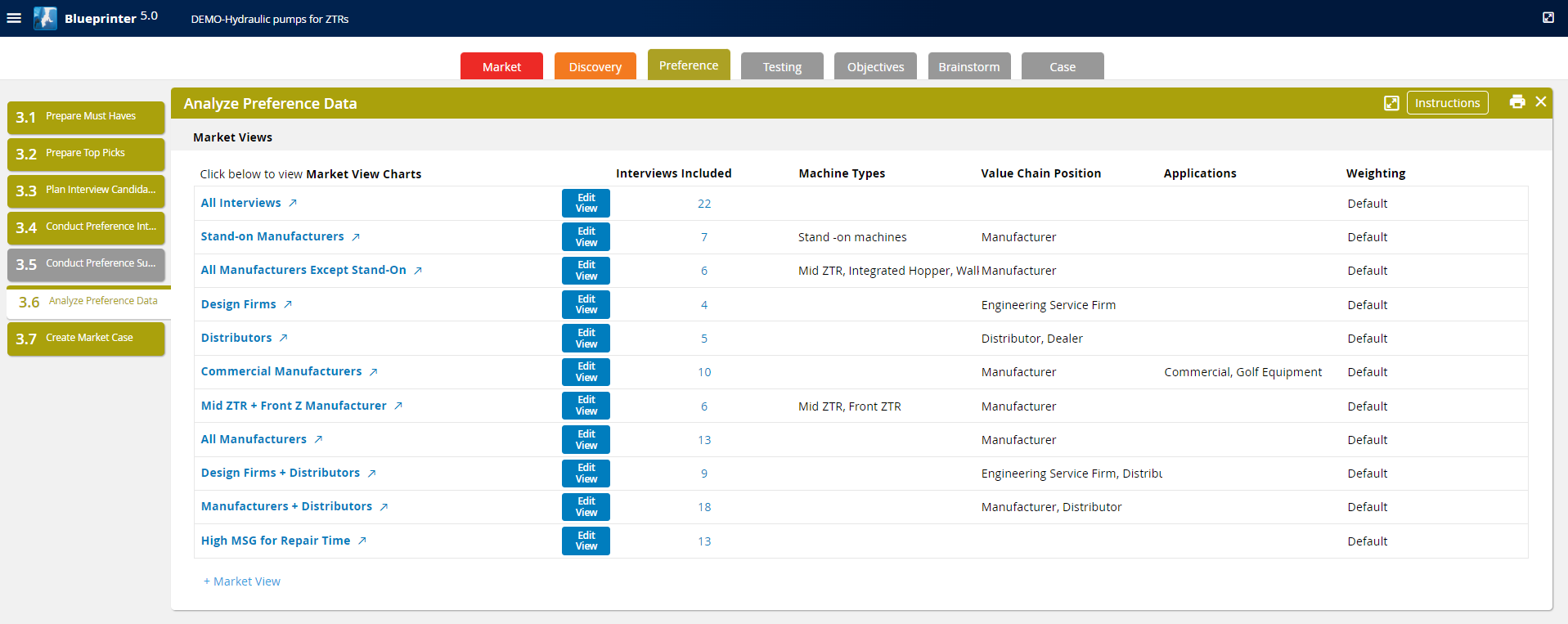
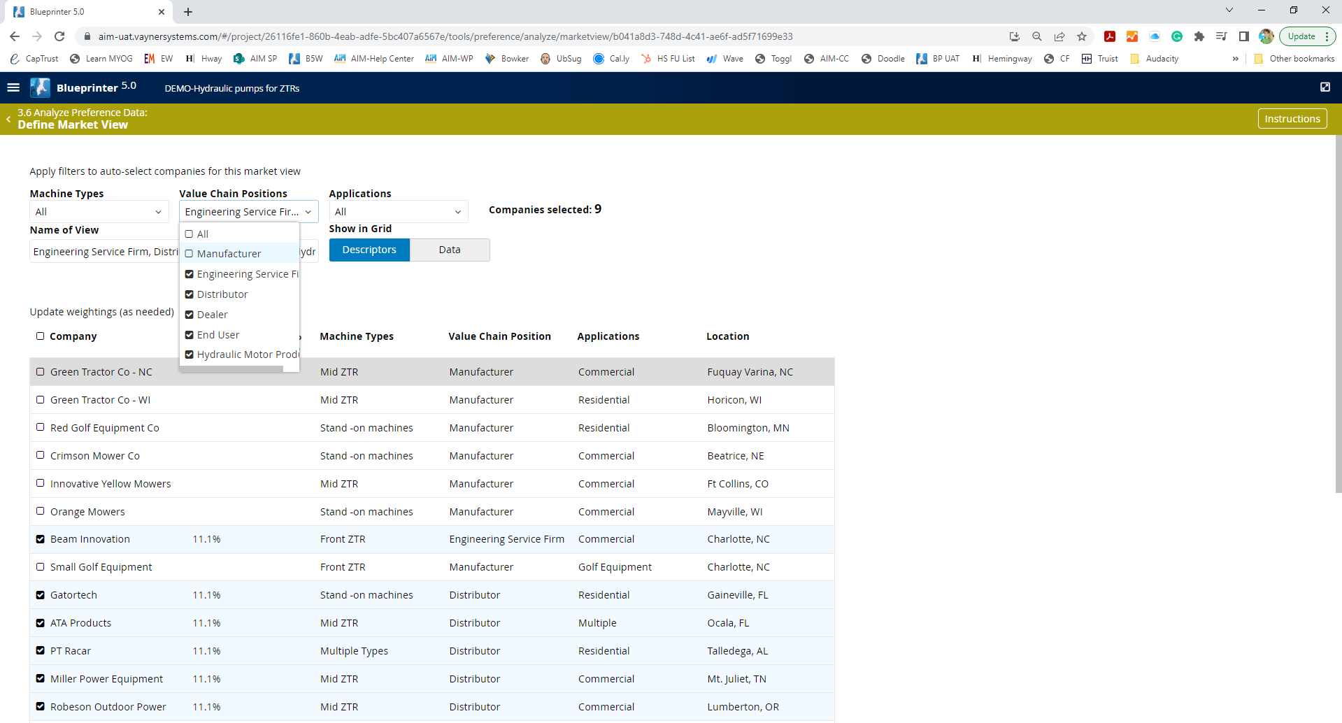
To create a new Market View, select "+ Market View." There are three primary ways to select the customer group for the MV:
1. Filter selection. To do so, make sure that "Descriptors" is selected within "Show in Grid." Then, choose the filters, and select options from the drop-down options. These are driven from "Settings" as created in Tool 2.1.
2. Data selection. Select "Data" on "Show in Grid." Then select the customers to be included within the MV. While this can be time-consuming, it's an effective way to identify groups of customers with common priorities outside of the settings.
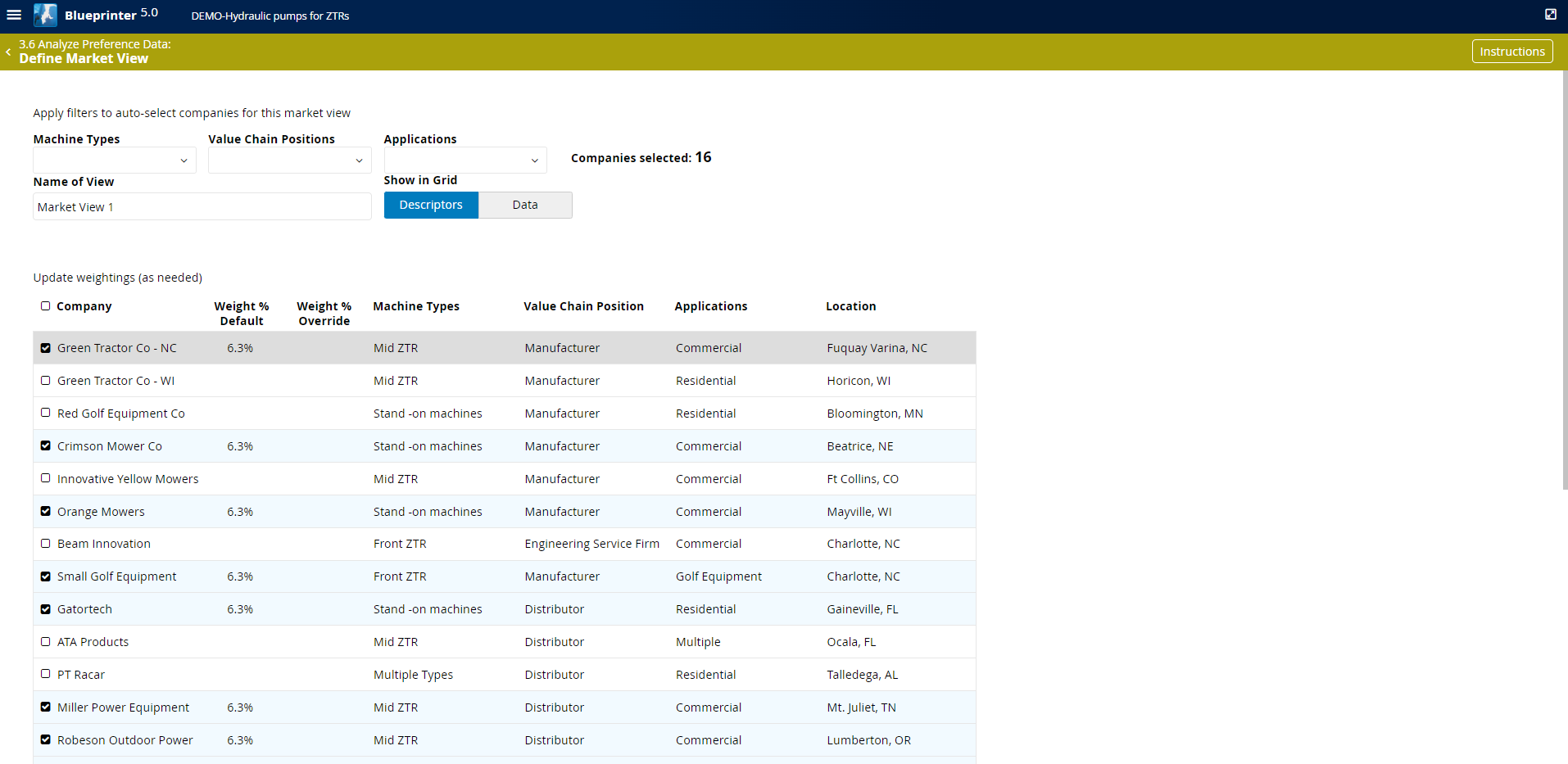
3. Manual customer selection. You can always create any sub-group by manually selecting customers.
Regardless of the method chosen, you can manually change the default customer weighting. The main reason for doing this is when a small number of customers represent a disproportionate amount of business.
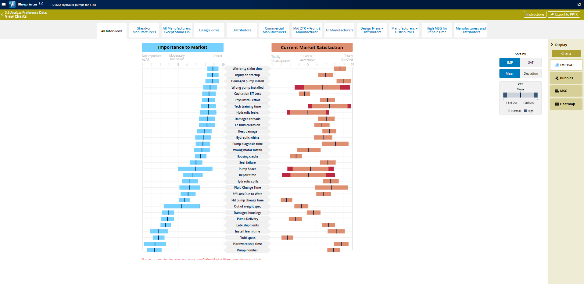
To proceed, select any Market View. Commonly, you'll start with "All Interviews" to see the scores from the broad market.
IMP+SAT Chart
This chart presents IMP and SAT scores side-by-side. On this chart, your primary task is to analyze the amount of variation in the data. The wider the bar, the more variation for an IMP or SAT score. If the standard deviation is greater than plus or minus 2 scale points, the variation is relatively high. Blueprinter will flag these situations with darker bars at the ends of each bar.
You can sort by IMP, SAT, Mean or Deviation.
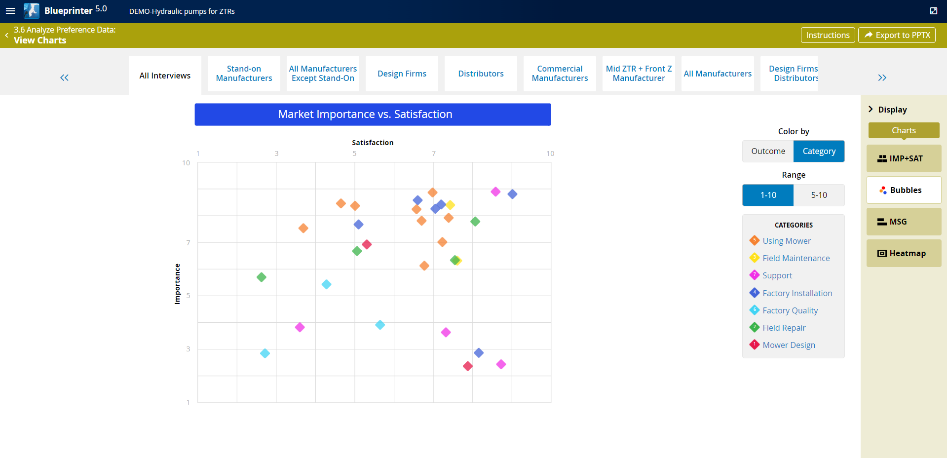
Bubbles Chart
The Bubbles Chart plots IMP vs SAT. The primary purpose of this chart is to view the shape of the data. Each bubble represents one outcome statement. Hover over one to read the outcome.
You can change the scale range from 1-10 or 5-10 and can either view all the outcomes, or just those from a particular category.
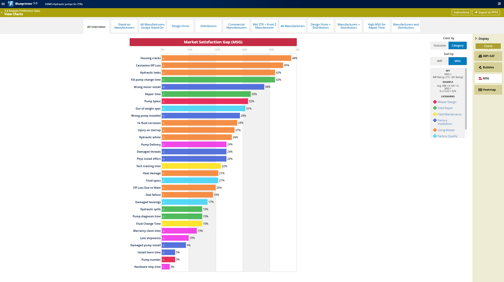
MSG Chart
The MSG chart shows a histogram of the "Market Satisfaction Gap" scores, which is Importance x (10 - Satisfaction). You can sort by IMP or MSG. You can also only view a subset of the outcomes by category.
Heatmap
The Heatmap chart represents the scores from Section 4: Top Outcomes from the Preference Interview. It shows the primary benefit from the top 10 outcomes by MSG This may not be populated if this data wasn't gathered during Preference Research.
Data Analyzing Strategy
Your goal is to identify a set of customers that have common priorities, which will be a market segment.
View IMP+SAT for All Interviews. If the standard deviations are narrow, then you may not need other Market Views.
If the standard deviations are wide, then iteratively create more Market Views until some can be found with less variation. Target one or more of these for innovation or marketing.