- BLUE HELP
- Blueprinter® Software
- Update Archive
-
Blueprinting Center & Methodology
- What is New Product Blueprinting?
- How is Blueprinting learned and applied?
- Blueprinting Center
- Blueprinting E-Learning Course
- How can I become Certified in New Product Blueprinting?
- How does Blueprinting fit with a stage-and-gate process?
- How does Blueprinting fit with strategic planning?
- How does Blueprinting fit with Design Thinking?
- How does Blueprinting fit with Lean Startup?
- How does Blueprinting fit with Minesweeper de-risking?
- How does Blueprinting fit with LaunchStar product launch?
- What innovation metrics should we use?
- What is "Jobs-to-be-Done?"
-
Blueprinter® Software
-
Market Segmentation (Step 1)
-
Discovery Interviews (Step 2)
- How to plan Discovery interviews
- Preparing your interview team
- Convincing customers to be interviewed
- How to handle confidential info in an interview
- How to conduct a Discovery interview
- Finding & using a digital projector for interviews
- How to conduct a customer tour
- How to debrief & follow-up a Discovery interview
- Engaging your sales colleagues in interviews
- Engaging distributors in interviews
- Interviewing customers down the value chain
- How to interview remotely with web-conferences
- How to interview at trade shows & other venues
- Interviewing in different global cultures & languages
- How to listen well during customer interviews
- How to probe during customer interviews
- How to gather economic data during interviews
- How to create & use Current State questions
- How to identify Must Haves (MH)
- How to select Top Picks (TP)
- How to use Trigger Maps
- How to form Outcome Statements
-
Preference Interviews (Step 3)
-
Rest of Blueprinting (Steps 4-7)
-
Everyday VOC
-
Minesweeper® De-risking
BLUEPRINTER® SOFTWARE UPDATE: September 19, 2019
Multiple navigation and usability improvements
Multiple navigation and usability improvements were made; resulting in a better user experience:
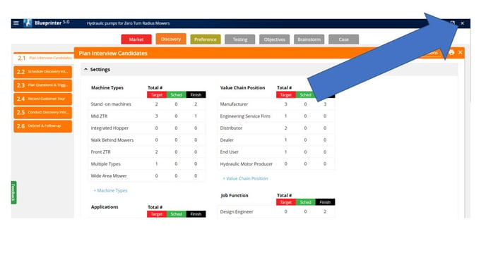
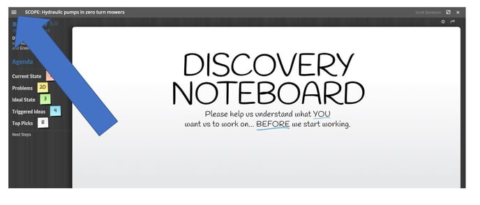
1) There was an "X" in the upper right hand corner of every screen. This "X" closed the project. Users often selected this by accident, inadvertently closing the project. Since, there are other ways of closing the project, this "X" has been removed. However, it remains on the Discovery Noteboard and the Preference Noteboard as the means to close those screens.

2) The menu icon, known as the "hamburger menu icon" has been removed from the Discovery Noteboard and Preference Noteboard. It is not needed on those screens, and this cleans up the appearance for those interviews.

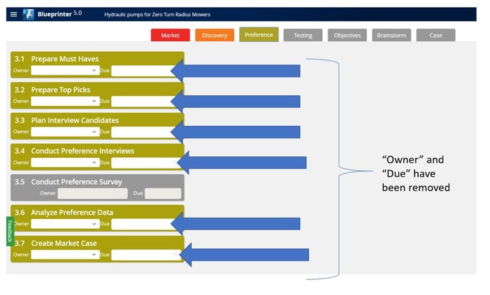
3) The "Owner" and "Due" boxes have been removed from each tool. This project management functionality was rarely used in practice, and the boxes made it difficult for new users to open each tool.

4) Within the Prep Sheet, the icons to add Current State questions and Trigger maps were standardized to be like the other "add" icons throughout the program.
